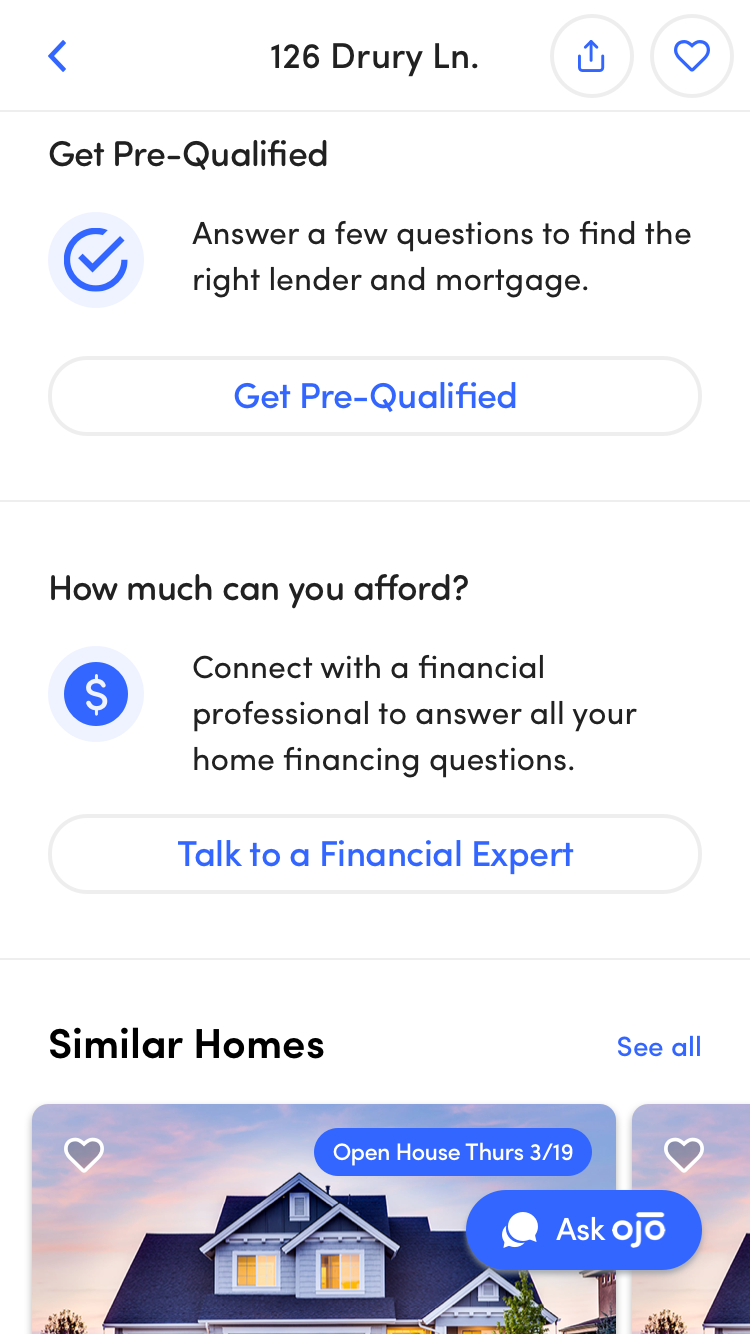
OJO Home Listing Page
Mobile Web App
User Experience, Product Design
6 months // 2019-2020
At OJO, I worked on the consumer app, a conversational AI platform that empowers consumers to make better decisions in the home buying process.
My responsibilities included redesigning the home listing page, as well as improving ways to get feedback signals from users.
As the new enhancements or features rolled out, it was rewarding to see the consumer engagement rise and business metrics improve.
Credits
UX, research, prototyping, design - Kailyn Lim
Design system - Zak Weiland, Kailyn Lim
Product - Kara Armstrong
Development - Tom Grochowicz, Thien Vo, Ronly Leung, Jessica Miller
Project Overview
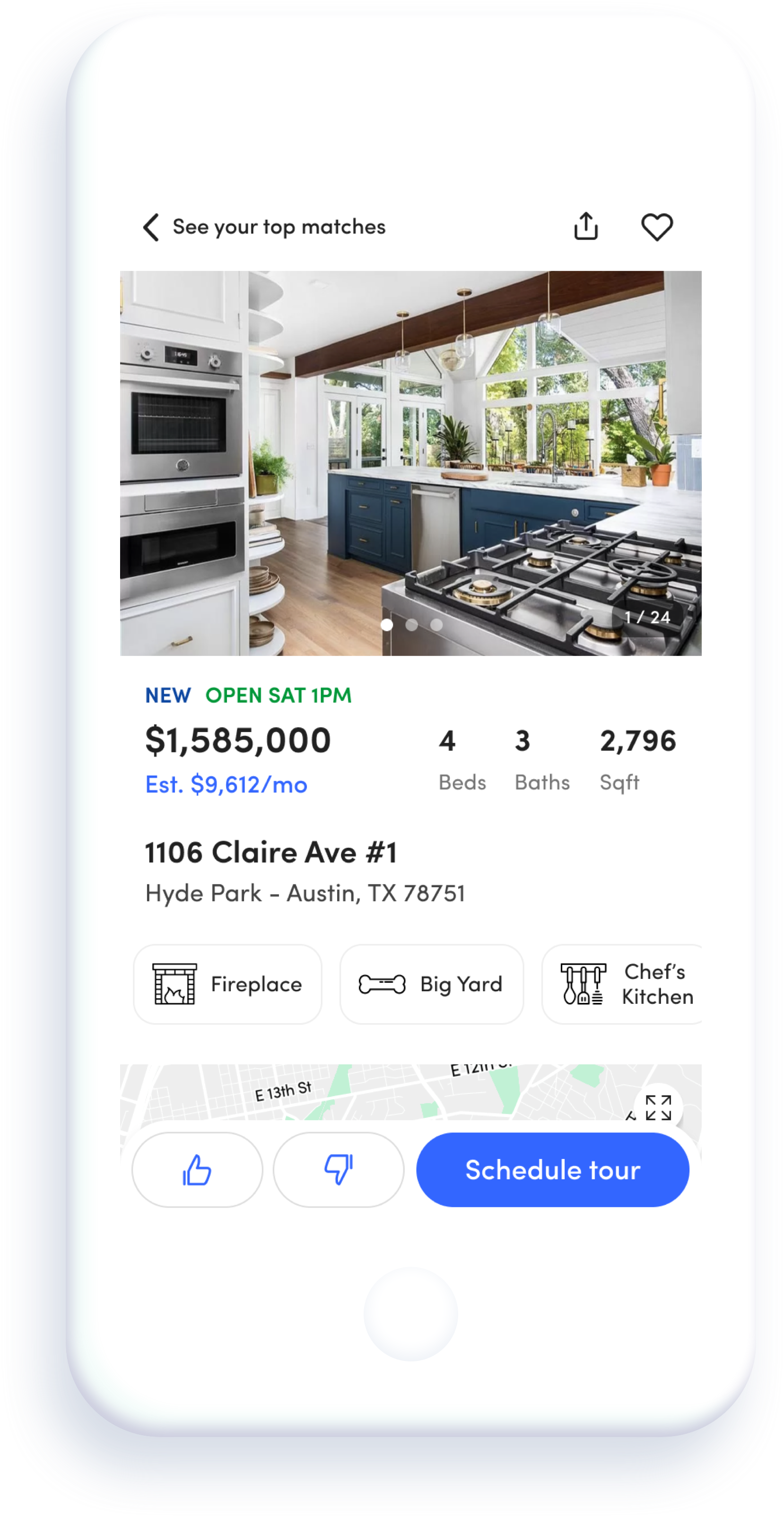
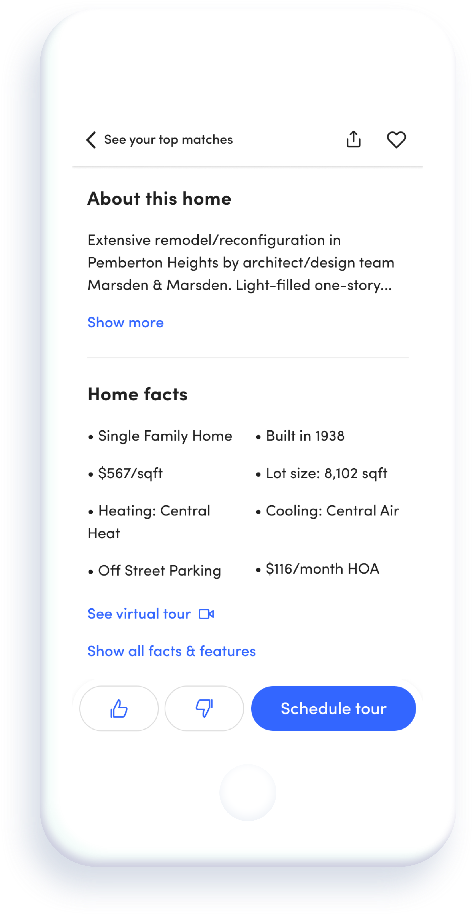
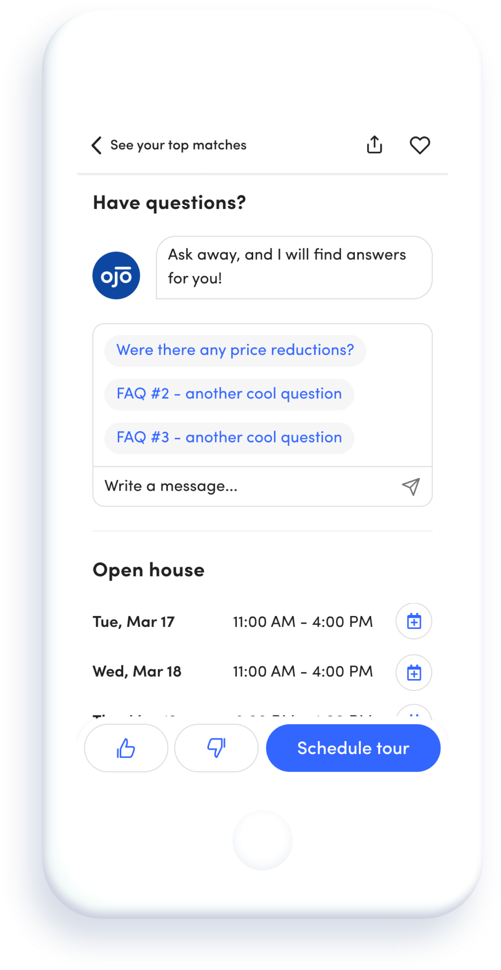
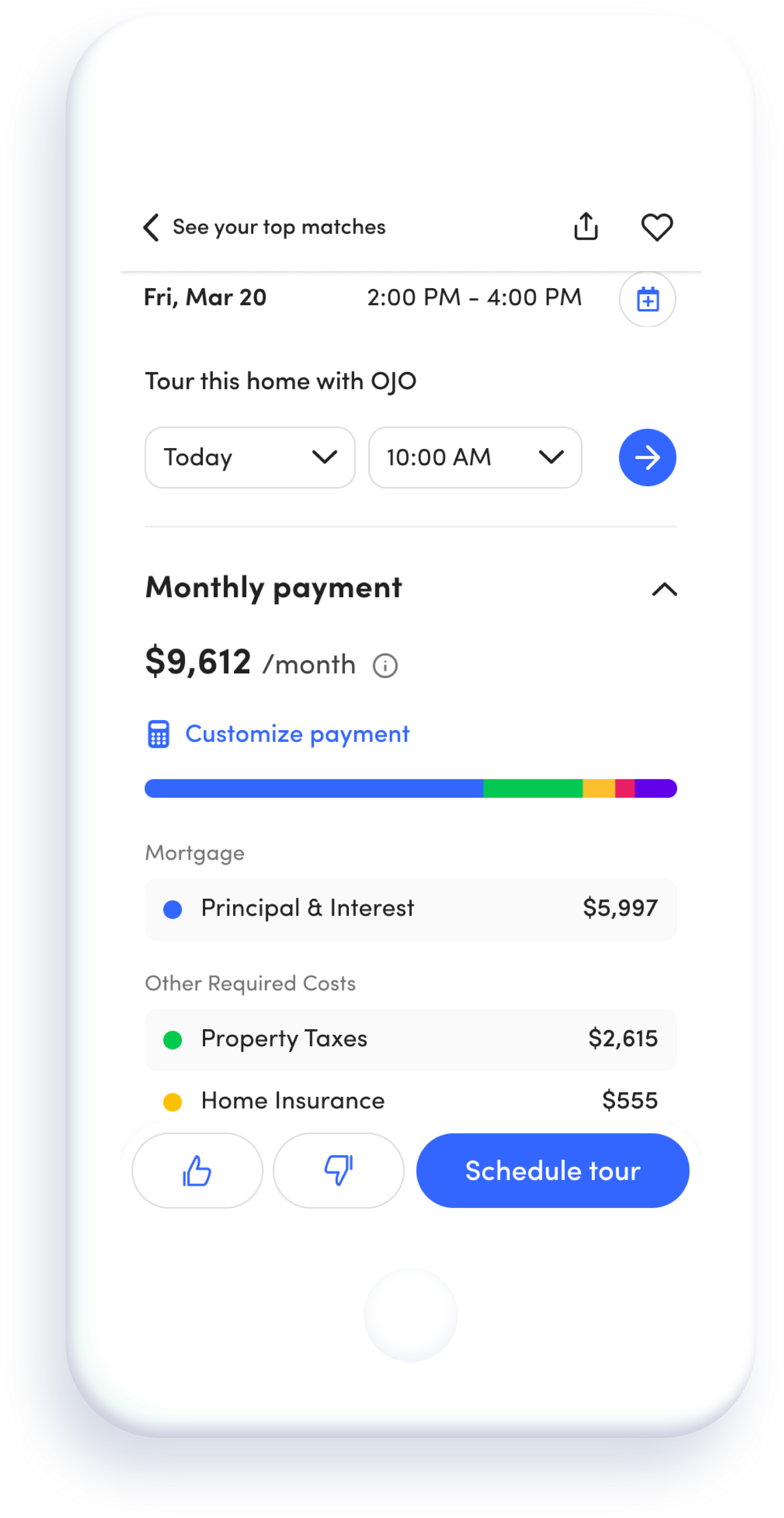
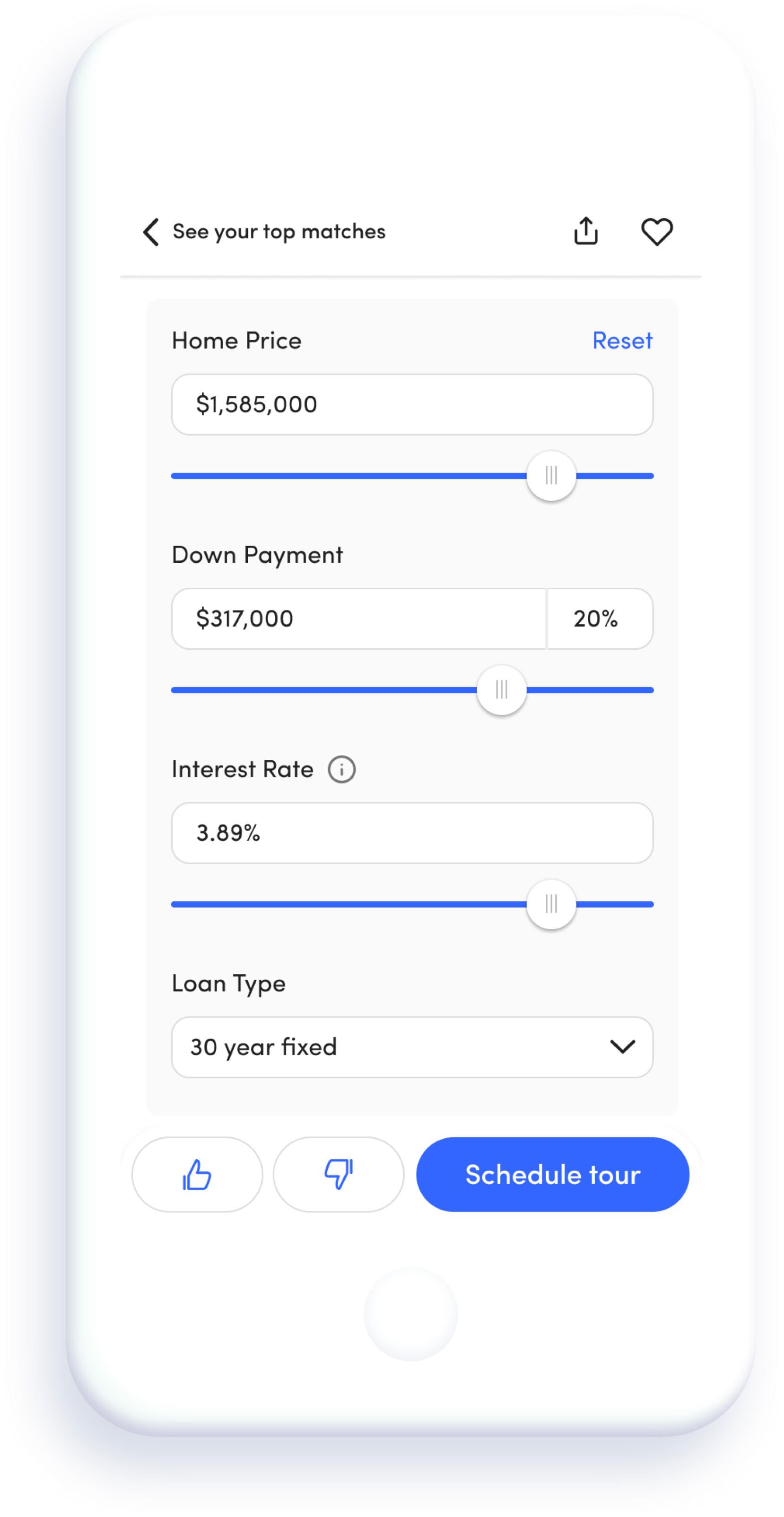
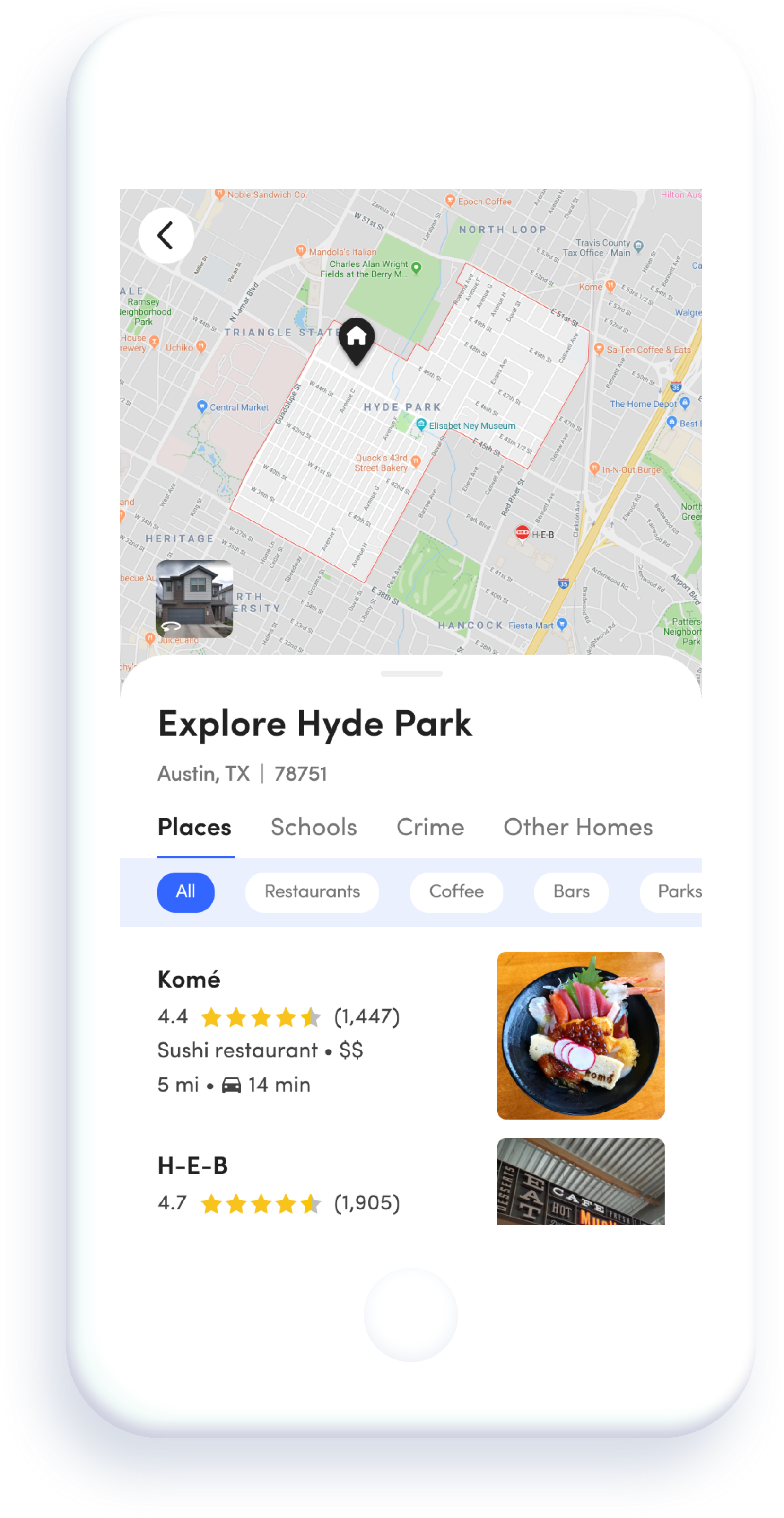
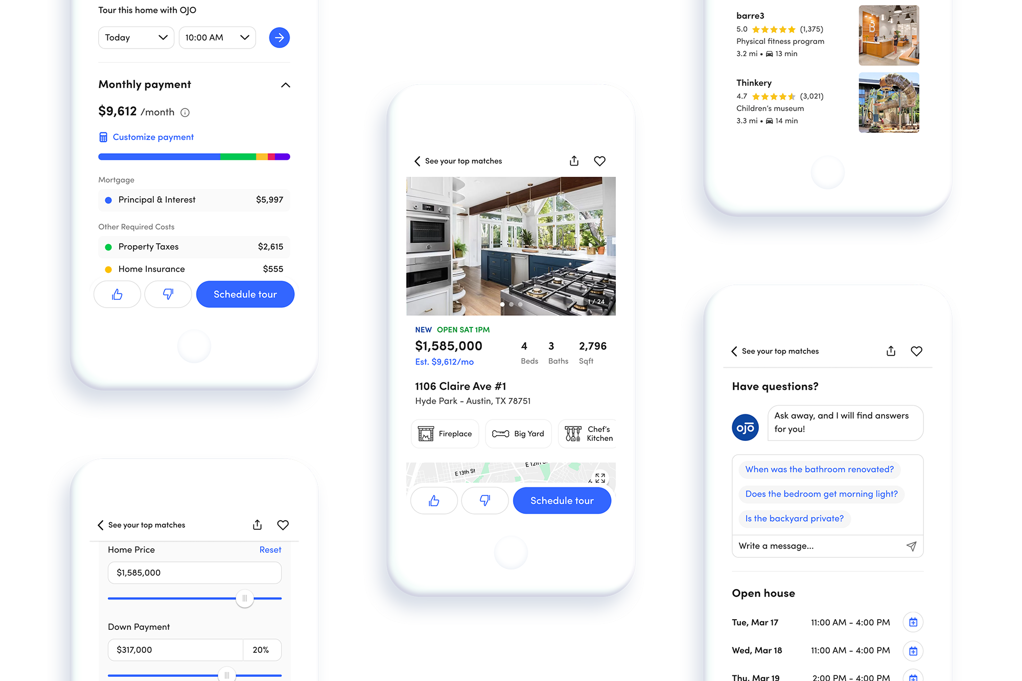
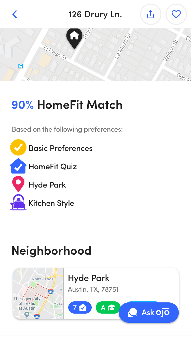
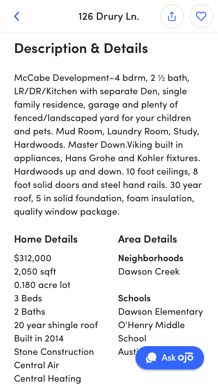
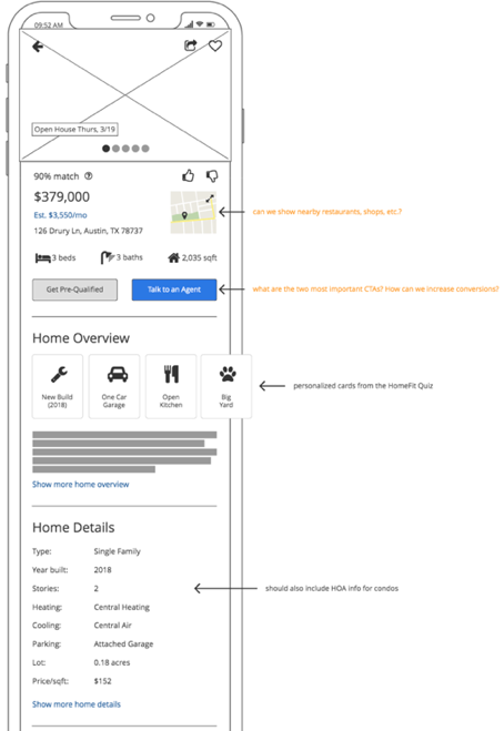
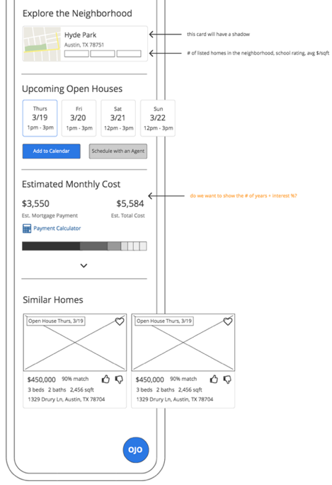
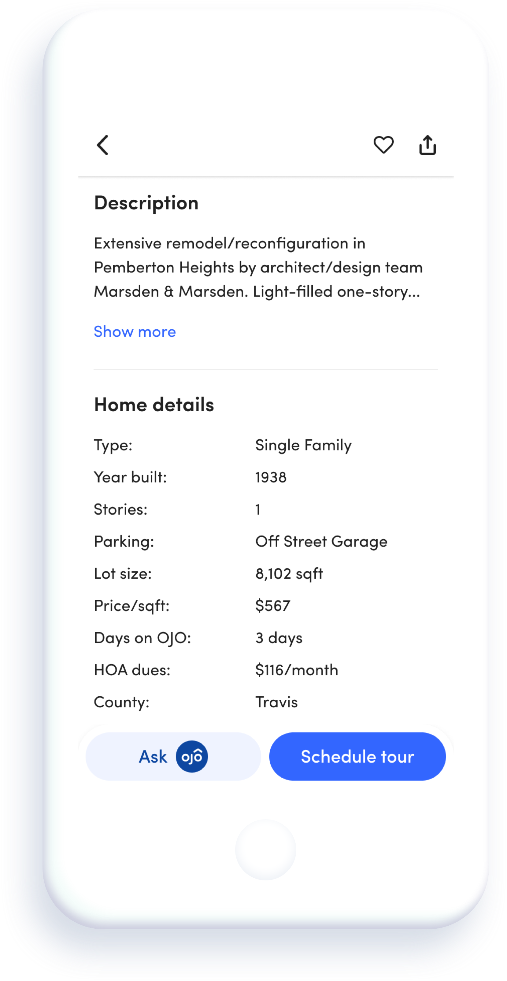
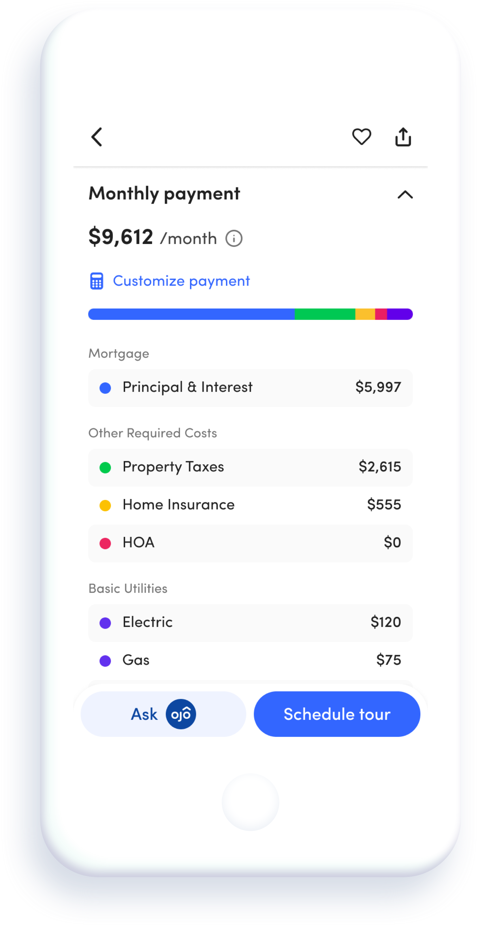
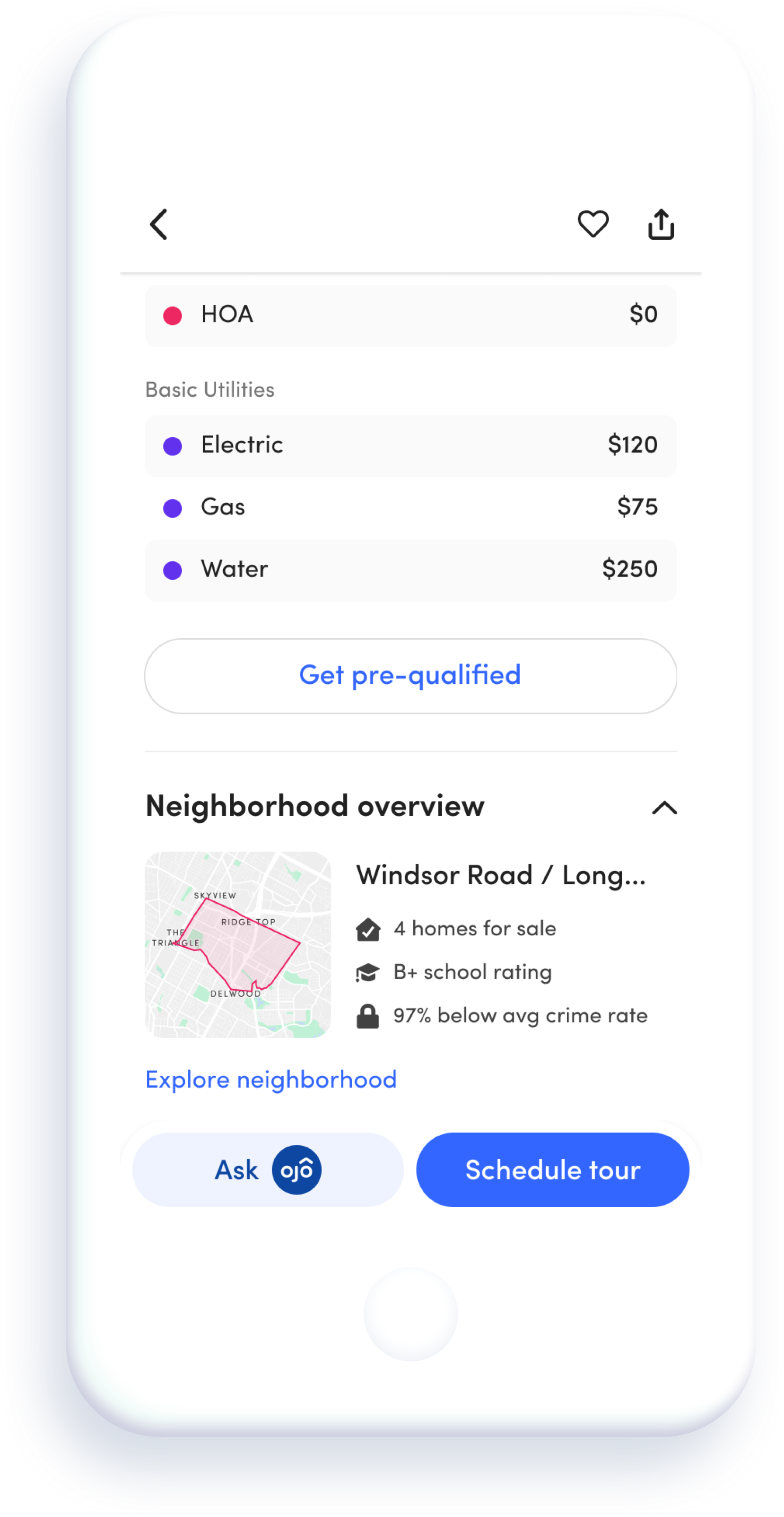
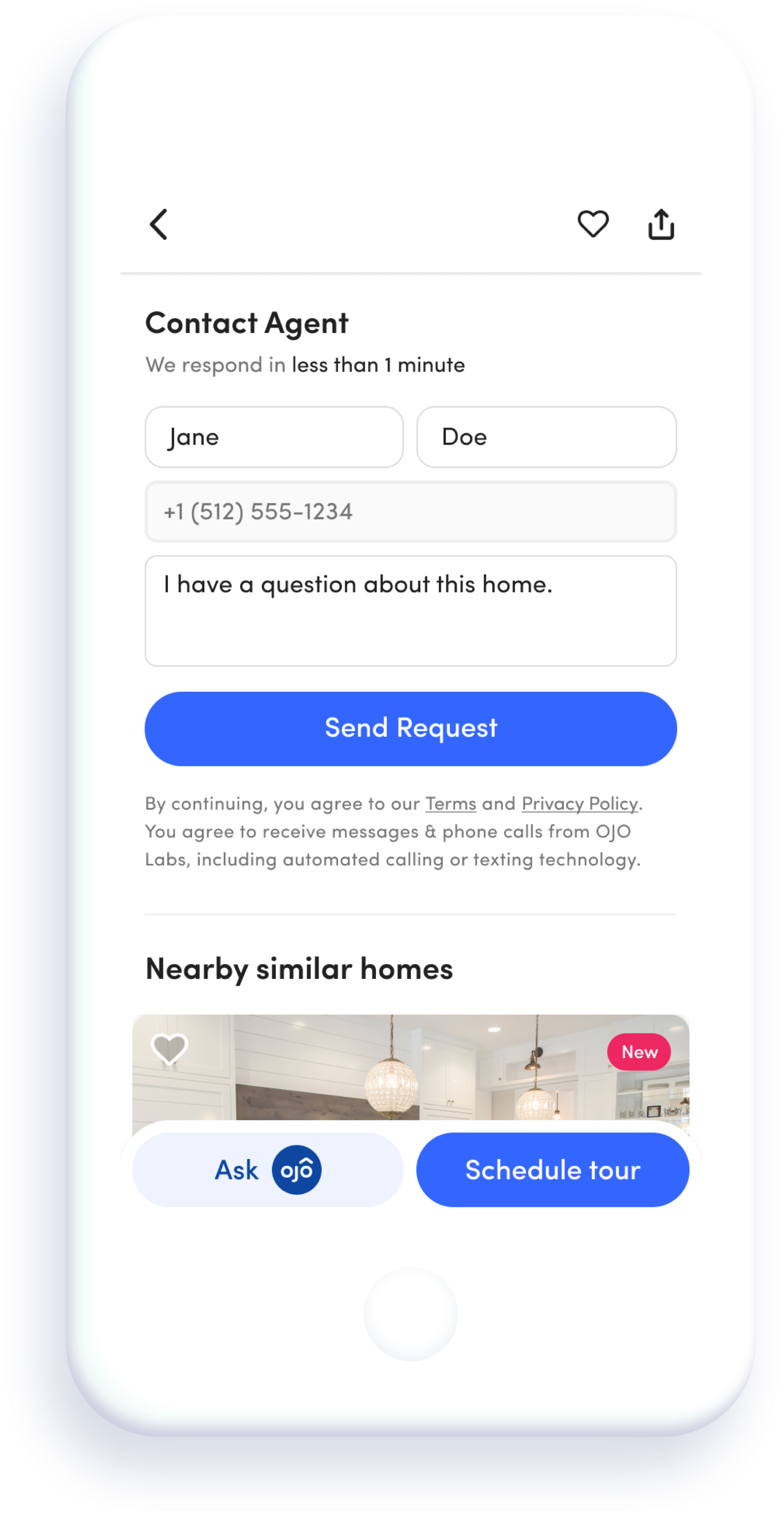
The OJO home listing page is the most visited page in the app, as it houses a tremendous amount of content and functionality about both the home and its associated neighborhood. It is also where OJO can learn a lot about the users' preferred style of home and enrich their recommendations going forward.
Problem
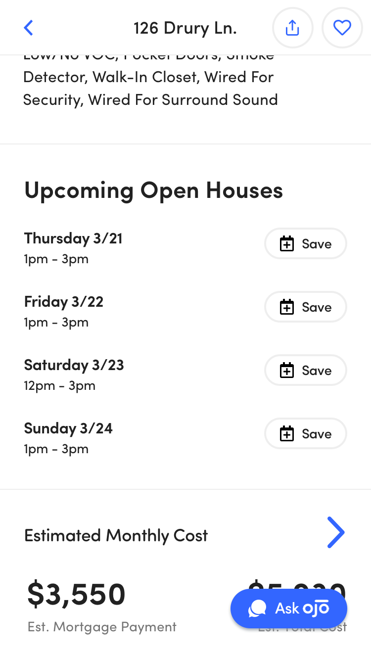
As additional features were added to the page over time, the efforts had become more "bolt-on" than thoughtful. Users had no clear way to schedule tours, and they had a difficult time finding the information they were looking for.
Solution
Make discovering new homes easier and more delightful by re-ordering the sections and improving visual hierarchy and consistency in the home listing page.
1. Research
In addition to the research that had already taken place prior to my start date at OJO, I did some quick research on my own.
INTERVIEWS
The perks of working on a consumer product - finding people to interview was easy! I had a few of my friends review the existing home listing page and got their gut check
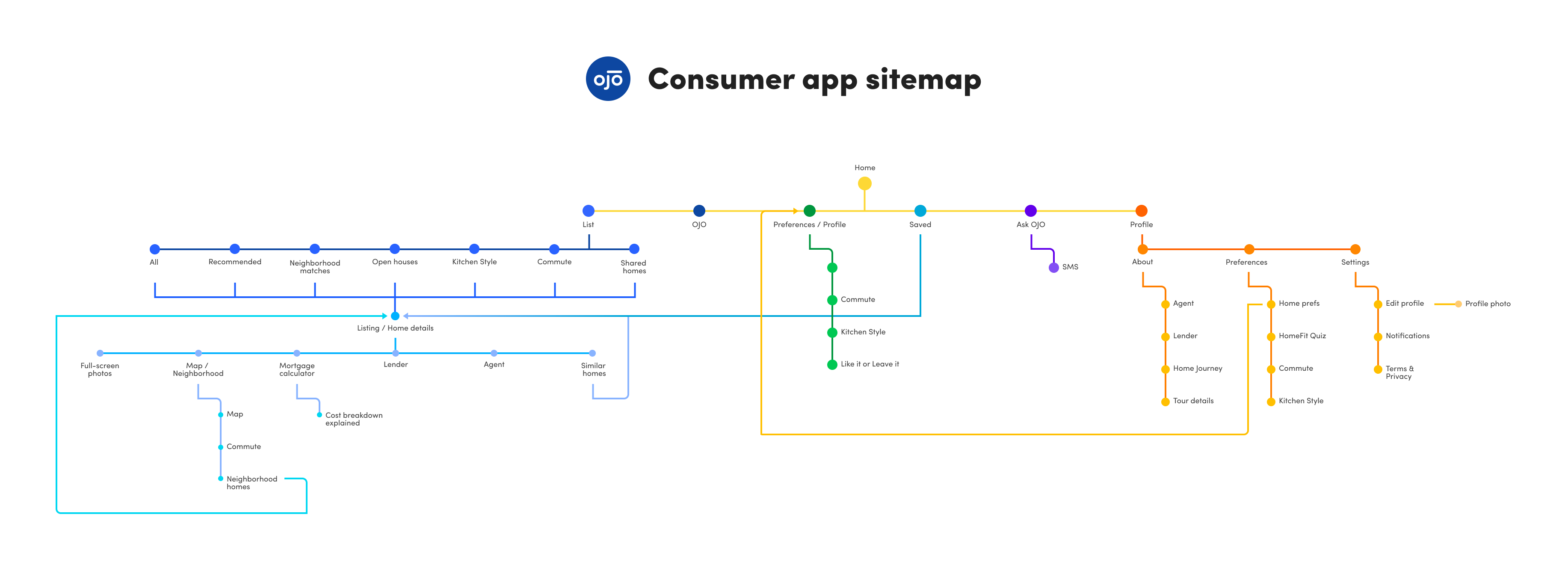
SITEMAP
Since I was new to the team and product, I created a sitemap of the consumer app to make sense of the overall information architecture.
COMPETITIVE ANALYSIS
Keeping up-to-date on what the competitors are doing is part of a designer's job. The competitors I closely monitored included Redfin, Zillow, Trulia, Realtor.com, Open Listings and Localize.city. I mostly took notes on how they structured the page and prioritized the MLS data.
2. Define
After my preliminary research, I worked with the product team to create a more concrete list of user problems, design solutions and hypotheses for the MVP version. This would be an ongoing project; we would launch the MVP version first, followed by subsequent releases with updates.
CHANGE PRIMARY CTA
REORDER THE SECTIONS
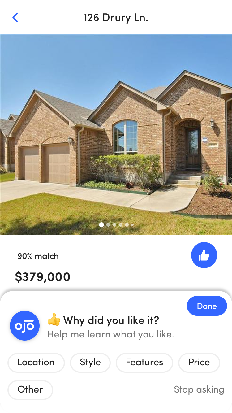
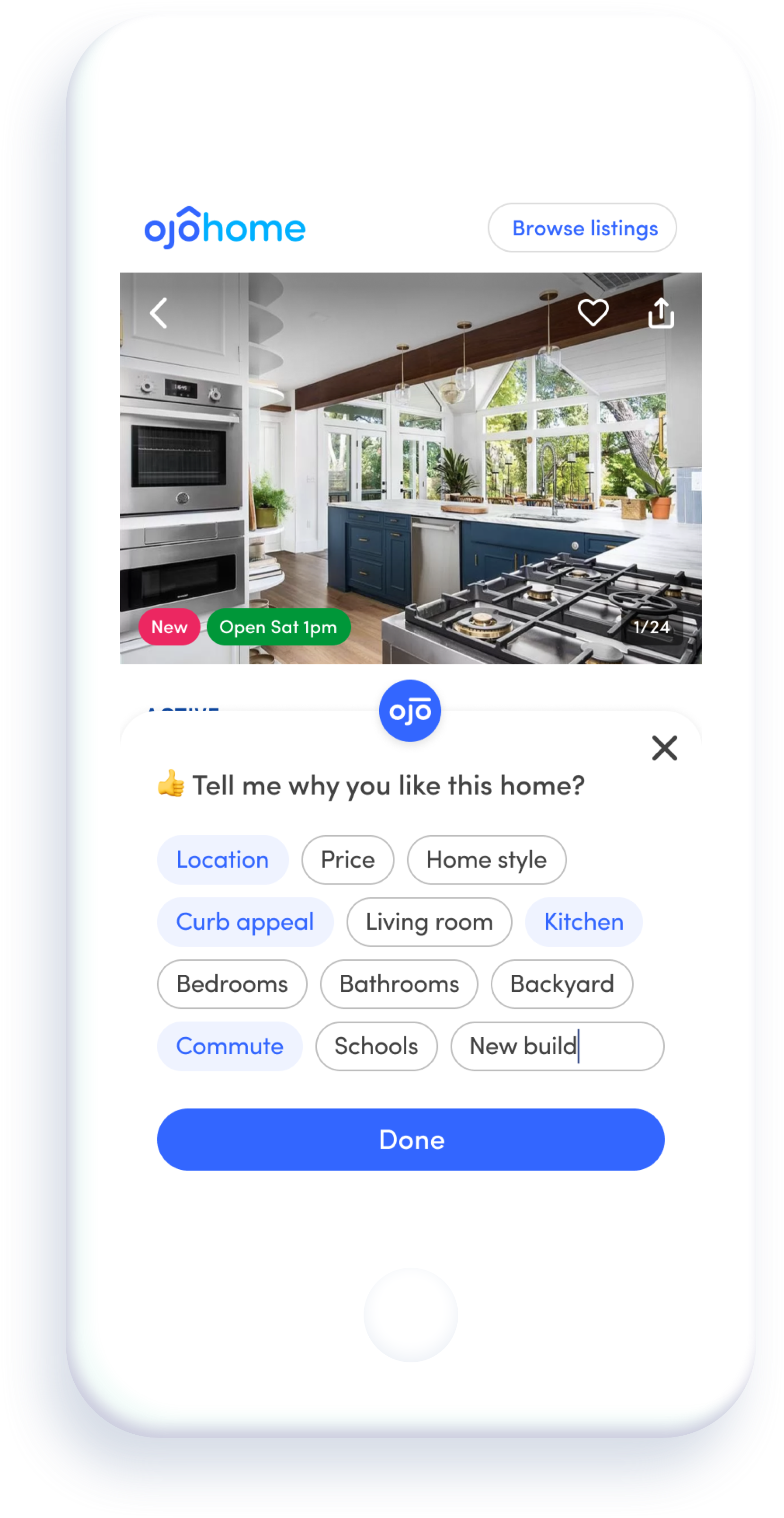
EXPAND THE PROPERTY FEEDBACK OPTIONS
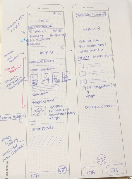
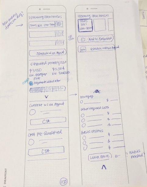
3. Ideate
When I started sketching and wireframing, I tried to not feel limited by the current data capability.
OJO was in a unique position to be able to utilize all of the explicit and implicit signals from the users in providing better home insights and recommendations in a few months.
4. Prototype & Validate
Everyone on the consumer app team was very excited for this redesign! For being the most visited page in the app, it was finally getting the love it deserved.
The devs were happy to provide feedback when I shared the design progress during weekly design reviews. They ensured that I had designs for every zero and error state scenario.
I created a clickable prototype in Figma and ran guerilla tests with colleagues to get usability feedback.
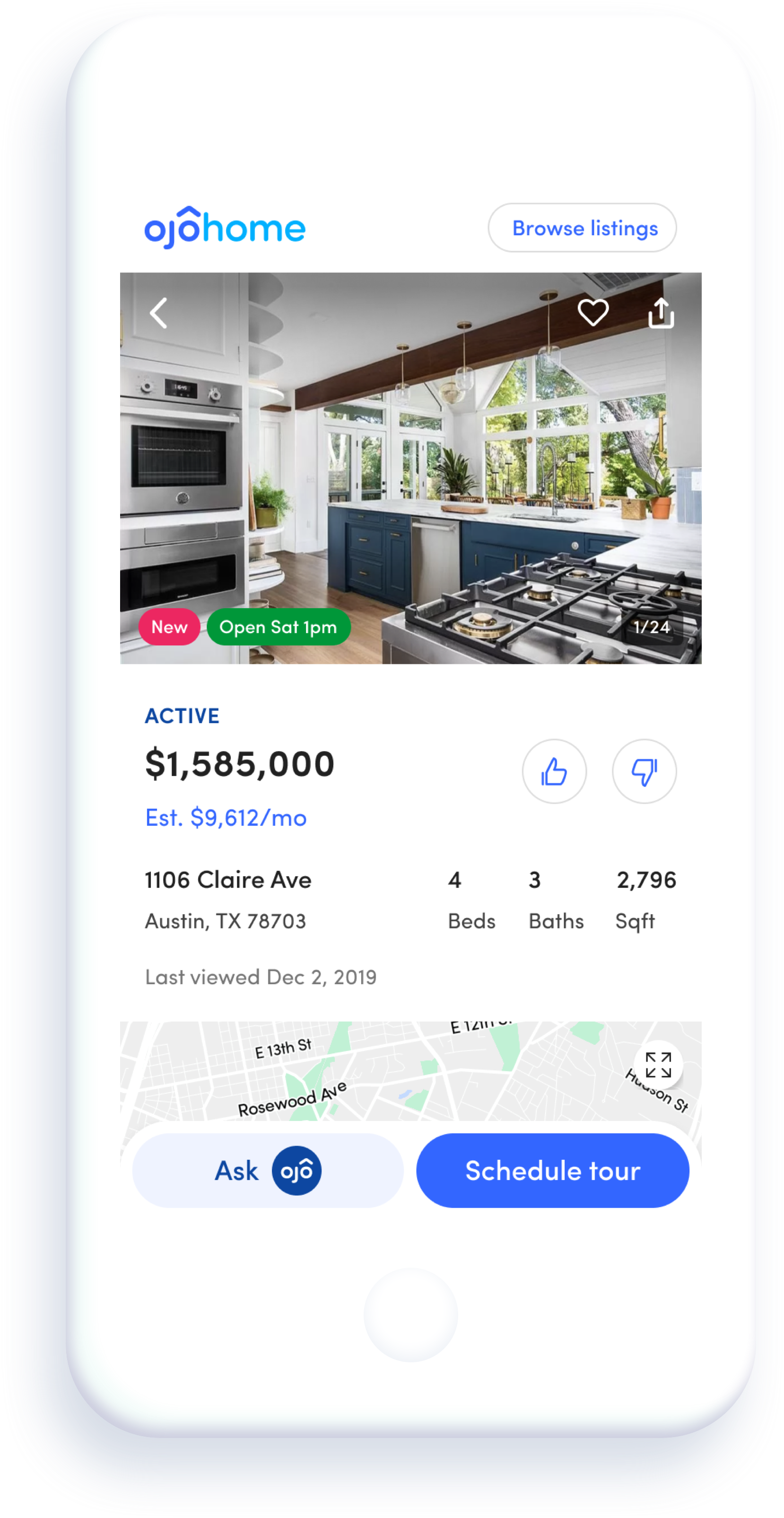
Final Deliverable (MVP)
Takeaways and Ideas/Exploration
Post the launch of MVP, there was an increase in property feedback (18%), property page CTA (41%), and referral rate (0.5%). As more data and metrics rolled in, I started to brainstorm and do exploration work on future improvements: